Upgrade from Eikon -> Workspace. Learn about programming differences.

For a deeper look into our Eikon Data API, look into:

Overview |  Quickstart |  Documentation |  Downloads |  Tutorials |  Articles

question

Upvotes
Accepted
1 1 1 2

How to create scatter plot + bubble chart?

Hello,

Can you please help me amend my code based on the following questions:

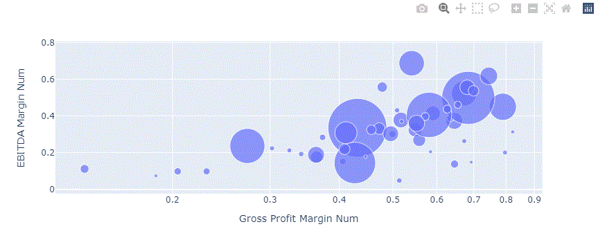
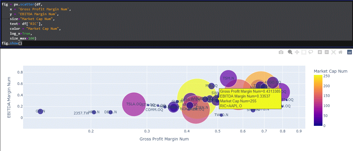
  1. How can I create a scatter plot showing Gross margin on x-axis and EBITDA margin on y-axis?

2. How can I create a BUBBLE chart showing the same data in #1 above, where the bubble is defined by market cap in USD?

Thank you

-----------------------------------------------

ric = 'AAPL.O'

df, err = ek.get_data([ric,"Peers("+ric+")"],

['TR.CompanyMarketCap',

'TR.RevenueMean',

'TR.GrossIncomeMean',

'TR.EBITDAMean'],

parameters = {

'Scale': '6',

'Curn': 'USD'

})

df

df.columns = ['RIC', 'Market Cap', 'Revenue', 'Gross Income', 'EBITDA']

df['Gross Profit Margin'] = df['Gross Income']/df['Revenue']

df['EBITDA Margin'] = df['EBITDA']/df['Revenue']

display(df)

codebook
icon clock
10 |1500

Up to 2 attachments (including images) can be used with a maximum of 512.0 KiB each and 1.0 MiB total.

Hello @tajinder.dhillon ,

Thank you for your participation in the forum.

Is the reply below satisfactory in resolving your query?

If yes, please click the 'Accept' text next to the appropriate reply. This will guide all community members who have a similar question. Otherwise please post again offering further insight into your question.

Thanks,

-AHS

@tajinder.dhillon

Hi,

Please be informed that a reply has been verified as correct in answering the question, and marked as such.

Thanks,

AHS

Upvote
Accepted
32.2k 40 11 20

Hello @tajinder.dhillon,

You can use scatter-plotting that is part of Pandas DataFrame:

df.plot.scatter(x = 'Gross Profit Margin', y = 'EBITDA Margin')

should so a scatter plot, you can find reference here:

Pandas documentation: pandas.DataFrame.plot.scatter

---

To create bubble charts, you may wish to use Plotly (that is also included in CodeBook), you will need to convert the column types to numerics, in order for them to be charted, for example:

import plotly.express as px

df['Market Cap Num'] = df['Market Cap'].astype(float)
df['EBITDA Margin Num'] = df['EBITDA Margin'].astype(float)
df['Gross Profit Margin Num'] = df['Gross Profit Margin'].astype(float)
df

and

fig = px.scatter(df, 
    x = 'Gross Profit Margin Num', 
    y = 'EBITDA Margin Num',
size="Market Cap Num", #Third Parameter
    log_x=True, size_max=60)
fig.show()

yields:

bubble.gif


bubble.gif (44.6 KiB)
icon clock
10 |1500

Up to 2 attachments (including images) can be used with a maximum of 512.0 KiB each and 1.0 MiB total.

Upvotes
1 1 1 2

many thanks @zoya faberov Zoya that worked. For the bubble chart, how would I be able to do the following (if you could amend the code so I can paste it that would be great):

  1. Change the colour of the bubbles using R,G,B (i.e. 0, 30, 255).
  2. Change the colour of a single bubble (i.e focus on single security to differentiate from peers)
  3. Display the RIC for each bubble.
  4. Display the RIC, x-value, y-value (helpful if the universe is small).
  5. Is there a way to make the actual chart larger so the bubbles have more room/make the chart easier to analyze quadrants?
  6. Are we able to use a heatmap colour scheme for the bubbles (i.e. red (values in bottom left quadrant) to green (values in top right quadrant)?)

Kind regards

icon clock
10 |1500

Up to 2 attachments (including images) can be used with a maximum of 512.0 KiB each and 1.0 MiB total.

Upvote
32.2k 40 11 20

Hello @tajinder.dhillon,

You can find these features and much more on plotly bubble charts on many external python learning resources, for example:

https://pythonwife.com/bubble-chart-with-plotly/

https://www.geeksforgeeks.org/bubble-chart-using-plotly-in-python/

https://plotly.com/python/bubble-charts/

Moving up from the super-quick bubble charts allowing to grasp the data and plotly.express module, to more customizable charts allowing for flexibility of expression, often involves the use of plotly.graph_objects module, as you will find in many of the included examples.

Hope that this information is of help to you?


icon clock
10 |1500

Up to 2 attachments (including images) can be used with a maximum of 512.0 KiB each and 1.0 MiB total.

Upvotes
1 1 1 2

Thank you @zoya faberov for the links.

Perhaps if you can share code for the below that will be OK for now as these are more important for my use case:

  1. Physically display the RIC for each bubble.
  2. Physically display the RIC, x-value, y-value (helpful if the universe is small).
  3. Change the colour of a single bubble (i.e focus on single security to differentiate from peers)


From one of the links you provided, I was able to incorporate hover_data=['RIC'], but this shows the RIC, however, only if I hover a bubble as opposed to seeing it physically on the chart.

Kind regards

icon clock
10 |1500

Up to 2 attachments (including images) can be used with a maximum of 512.0 KiB each and 1.0 MiB total.

Upvotes
32.2k 40 11 20

Hello @tajinder.dhillon ,

The simplest implementation, in my view, that I think may work is something like:

fig = px.scatter(df, 
    x = 'Gross Profit Margin Num', 
    y = 'EBITDA Margin Num',
    size="Market Cap Num", 
    text= df['RIC'],
    color = "Market Cap Num",
    log_x=True, 
    size_max=100)
fig.show()

That yields for me a chart like:

bubblecolor.gif

Not the prettiest and too busy for my test, but with the largest and the smallest of the values clearly visible because of the color scale.


bubblecolor.gif (135.4 KiB)
icon clock
10 |1500

Up to 2 attachments (including images) can be used with a maximum of 512.0 KiB each and 1.0 MiB total.

Upvotes
32.2k 40 11 20

Hello @tajinder.dhillon ,

I have also worked on changing the colour of a single bubble (focus on single security to differentiate from peers), here is my take:

1. Prepare numeric and adjusted values for columns

df['Market Cap Num'] = (df['Market Cap']).astype(float)
df['Market Cap Num Adj'] = (df['Market Cap']/10000).astype(int)
df['EBITDA Margin Num'] = df['EBITDA Margin'].astype(float)
df['Gross Profit Margin Num'] = df['Gross Profit Margin'].astype(float)
df

2. Create array of the same blue RGB value objects, and put in a single marker of RGB red at specific position:

import numpy as np

colorArray= np.full(
  shape=len(df['EBITDA Margin Num']),
  fill_value='rgb(93, 164, 214)',
   dtype=object
)

colorArray[20] = 'rgb(255, 65, 54)'
#colorArray

3. Chart with Plotly Graph Objects:

import plotly.graph_objects as go
                     

fig = go.Figure(data=[go.Scatter(
    x=df['Gross Profit Margin Num'], 
    y=df['EBITDA Margin Num'],
    text=df['RIC'],
    mode='markers+text',
    marker=dict(
        color=colorArray,
        size=df['Market Cap Num Adj'],
    ),
)])

fig.show()

The results on my side look like this:

bubbleredblue.gif

I hope this is of help


bubbleredblue.gif (67.0 KiB)
icon clock
10 |1500

Up to 2 attachments (including images) can be used with a maximum of 512.0 KiB each and 1.0 MiB total.

Upvotes
1 1 1 2

thank you @zoya faberov , is there a way to implement a "max_size=100" in the below instead of having to divide market cap by an arbitrary number?


fig = go.Figure(data=[go.Scatter(

x=df['Gross Profit Margin %'],

y=df['EBITDA Margin %'],

text=df['RIC'],

mode='markers+text',

marker=dict(

color=colorArray,

size=df['Market Cap Num Adj'],

icon clock
10 |1500

Up to 2 attachments (including images) can be used with a maximum of 512.0 KiB each and 1.0 MiB total.

Upvotes
32.2k 40 11 20

Hello @tajinder.dhillon ,

Yes you can- slightly more code:

import plotly.graph_objects as go
                     
df['Market Cap Num'] = (df['Market Cap']).astype(int)

fig = go.Figure(data=[go.Scatter(
    x=df['Gross Profit Margin Num'], 
    y=df['EBITDA Margin Num'],
    text=df['RIC'],
    mode='markers+text',
    marker=dict(
        color=colorArray,
        size=df['Market Cap Num'],
        sizemode='area',
        sizeref=2.*max(df['Market Cap Num'])/(40.**2),
        sizemin=4
    ),
)])

fig.show()

Resulting in:

bubble.gif

... however, in my opinion, visual representations of content are always like this- a simple one can be put together quite quickly, but really good ones have to take care of every detail, and end up taking time to get them right :)


bubble.gif (36.3 KiB)
icon clock
10 |1500

Up to 2 attachments (including images) can be used with a maximum of 512.0 KiB each and 1.0 MiB total.

Write an Answer

Hint: Notify or tag a user in this post by typing @username.

Up to 2 attachments (including images) can be used with a maximum of 512.0 KiB each and 1.0 MiB total.